Minimalism Gone Wrong and Why Your Website Feels Like an Empty Room
 Minimalism is like salt. A little enhances everything. Too much, and you ruin the dish. Somewhere along the way, businesses got the idea that "clean and simple" meant "remove everything people might find useful." Now, we have websites that feel less like a digital storefront and more like an abandoned art gallery.
When Simplicity Becomes an Obstacle
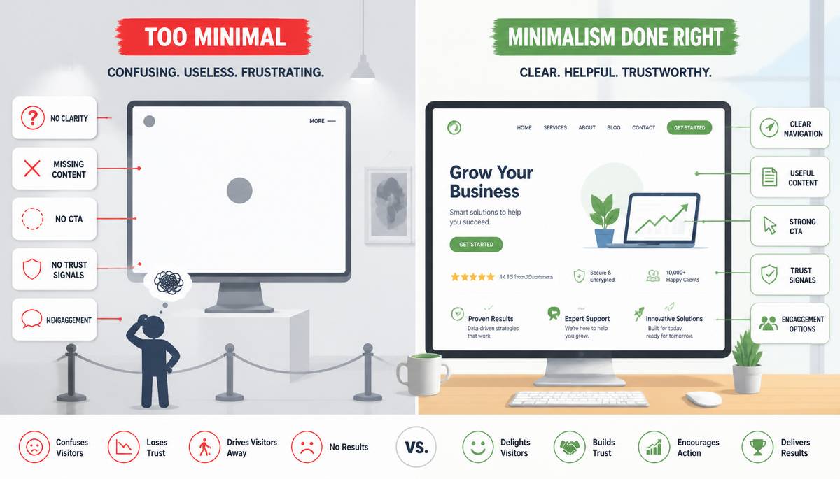
Minimalism, when done well, can create a sleek, focused user experience. When done poorly, it leaves visitors lost, confused, and questioning their life choices. Consider the trend of navigation menus so streamlined they barely exist. A visitor arrives, eager to learn about your service, only to find a single link labeled "More." Clicking it does nothing. Clicking it again still does nothing. Is this a test? A game? No—just a bad website.
The Great Content Purge
In the quest for a cleaner aesthetic, companies often strip away content people actually need. Product descriptions? Gone. Testimonials? A thing of the past. Contact information? Hidden like a buried treasure. Some sites take it a step further, removing text entirely in favor of cryptic icons. What does that floating circle with a dot mean? Is it a button? A decoration? A secret handshake? We may never know.
Too Much White Space, Not Enough Substance
Whitespace is a design principle, not an excuse to forget half the website. The obsession with empty space has led to layouts that require Olympic-level scrolling endurance. Visitors are left scrolling, scrolling, scrolling, hoping something of substance appears. Instead, they find more whitespace. At some point, they give up, assuming the page never loaded properly.
The Death of Call-to-Actions
A button labeled “Buy Now” is not an aggressive marketing tactic. It’s a sign of basic functionality. Yet, in the name of minimalism, many sites have reduced calls-to-action to vague, passive text like “Explore” or “Continue.” Continue… where? Explore… what? It’s as if designers are hoping users will just instinctively figure it out. Spoiler: They won’t.
Where Did the Trust Signals Go?
Trust is a fragile thing, and websites that take minimalism too far often forget to include the elements that establish credibility. Gone are security badges, customer reviews, and even basic “About Us” pages. Instead, visitors are left wondering if they’ve just entered a legitimate business website or an elaborate scam operation run out of someone’s basement.
Let’s be clear: A page with nothing but a logo and a vague “We innovate the future” tagline is not reassuring. Users need details, proof, and at least some indication that your company is run by actual humans and not an AI experiment gone rogue.
The Search for Engagement Points
Many ultra-minimalist websites strip away interactive elements under the guise of simplicity. Comments sections? Too messy. Social media links? Clutter. Chat support? Why bother? The result is a site that feels eerily quiet—like walking into a store where no one makes eye contact.
Engagement isn’t a nuisance; it’s how users connect with brands. When companies make it difficult to interact, ask questions, or even share content, they’re actively pushing people away. If your users feel like they’re navigating a museum exhibit rather than a living, breathing brand experience, something has gone wrong.
How to Get Minimalism Right
So, how do you balance clean design with functionality? Start by asking: “What does the user actually need?” Instead of stripping a site down to its bare bones, focus on removing distractions while keeping essential elements intact. Here’s a better approach: - Keep navigation clear and intuitive. If someone has to think too hard about how to move around your site, you’ve already lost them.
- Provide enough content to inform and persuade, not just impress with whitespace.
- Use calls-to-action that actually guide users to do something instead of leaving them guessing.
- Maintain trust signals—testimonials, security badges, and human details matter.
- Ensure engagement opportunities exist. Give users a reason to interact, whether through comments, social links, or support options.
Whitespace Doesn't Pay the Bills
Minimalism isn’t the enemy. Poor execution is. A clean, modern website is great—until it removes everything that makes it usable. Businesses need to remember that a website isn’t just an art piece; it’s a tool meant to convert visitors into customers.
At the end of the day, aesthetics should never come at the expense of function. A website that’s beautiful but ineffective is like a fancy restaurant that serves empty plates. Sure, the presentation is stunning, but people came here to eat.
|
|