A Retro Odyssey in Late '90s Web Design
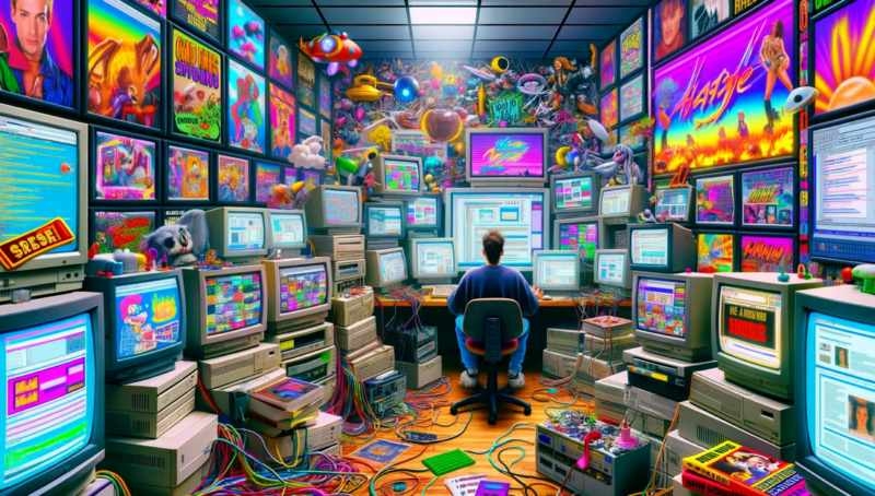 In the late '90s, when the internet was still a wild, uncharted territory, and web design was akin to witchcraft, I found myself knee-deep in the pixelated trenches of early website creation. Those were the days of HTML heroics, a time when a man was measured not by the content of his character, but by the speed of his page load.
The world was simpler then, or so we thought, as we navigated through the digital jungle with our 56k modems, praying to the internet gods for a stable connection. Websites weren't just websites; they were digital masterpieces, crafted with the finesse of a sledgehammer and the subtlety of a neon sign.
Flash was the king. A tyrant, really. A beast that devoured bandwidth and spat out glittering, animated monstrosities that danced across the screen like a disco on steroids. We didn't just use Flash; we abused it. Every website had to have it, like a digital badge of honor, a testament to our avant-garde ineptitude.
I remember my first website, a Frankenstein's monster of animated GIFs, blinking text, and a background that could induce seizures. It was a thing of beauty, a digital tapestry woven from the finest threads of the early internet. "Content is king," they said. To hell with content! Give them fireworks, give them flashing banners, give them a scrolling marquee that reads, "Welcome to my homepage," because nothing says 'home' like a relentless assault on the senses.
Load times? Ha! Load times were for the weak. We designed websites like we were loading a cannon, cramming in as much as possible and hoping it wouldn't explode on impact. A visitor would click on a link and then go make a sandwich, maybe watch an episode of "Friends," and return just in time to see the homepage finally materialize.
And let's not forget the music. Auto-playing MIDI files that serenaded you with the tinny melody of a thousand digital angels being strangled. It was mandatory. It didn't matter if it clashed with the actual content. A website without music was like a bar without alcohol – pointless and sobering.
Tables were our building blocks, a way to impose some semblance of order in the chaotic abyss of early web design. Nested tables, tables inside tables, a veritable Inception of tabular design. It was like building a house of cards in a wind tunnel, a delicate balancing act between what you wanted to do and what the laws of HTML would allow.
The color palette was a psychedelic smorgasbord, a kaleidoscope of clashing hues that would make Picasso weep. Web-safe colors? More like web-safe insanity. We painted the digital canvas with all the subtlety of a toddler on a sugar high, mixing and matching colors with reckless abandon.
Navigation was an afterthought, a labyrinthine maze of hyperlinks that led you down a rabbit hole of broken dreams and 404 errors. Websites weren't designed to be user-friendly; they were digital obstacle courses, a test of patience and sanity for any brave soul who dared to venture within.
And in those days, everyone was a web designer. Your neighbor's kid, the guy who fixed your computer, your aunt's dog – they all had a GeoCities page, a digital plot of land in the sprawling metropolis of early internet. It was a time of exploration, of experimentation, a digital gold rush where the only rule was that there were no rules.
We were pioneers, trailblazers in a world that was still figuring out what it meant to be online. We made mistakes, oh so many mistakes, but we did it with the reckless abandon of a toddler wielding a crayon.
And now, as I sit here, a relic of a bygone era, I can't help but feel a twinge of nostalgia for those days of digital anarchy. The internet has grown up, become sleeker, more sophisticated, but it's lost a bit of its soul, its wild, untamed spirit.
So here's to the late '90s, to the garish websites and the mind-bending designs, to the Flash animations and the MIDI soundtracks. It was a time of madness, of glorious, unapologetic madness, and damn, it was fun.
|
|




 In the late '90s, when the internet was still a wild, uncharted territory, and web design was akin to witchcraft, I found myself knee-deep in the pixelated trenches of early website creation. Those were the days of HTML heroics, a time when a man was measured not by the content of his character, but by the speed of his page load.