webdesignlistings.org
A human-review, detailed website review service for web design businesses
★ Get your own unique FAQ + Selling Points on your profile page
★ be seen by 1000s of daily visitors and win new business
webdesignlistings.org Miniblog
Why Do So Many Website Builder Sites End Up Looking Weirdly Identical?
 Website builders promise freedom, then hand half the internet the same haircut. That’s why so many sites come out looking oddly interchangeable: people start with the same polished templates and leave them mostly untouched. A photographer, a coach and a boutique agency can end up wearing the exact same digital outfit.
That’s not a disaster. For many small businesses, these platforms are still the quickest, cheapest route to a decent online presence. But “decent” and “distinctive” are not the same thing. If standing out matters, you need to customise properly, not just swap in your logo and call it a brand.
There’s another little magic trick in play: the cheap price you notice first is rarely the one you pay. Basic plans look friendly enough, then the meter starts ticking for ecommerce tools, your own domain, analytics and removing the builder’s branding.
And once you’re in, you’re in. Most builders make moving your design elsewhere awkward at best, so choosing badly can mean rebuilding from scratch.
Then there’s performance. Keep a site lean and it usually behaves. Stuff it with giant image galleries, video and widgets galore, and it starts lumbering about like it’s wearing wet denim.
Support varies too. Some services put you through to a useful human. Others send you into chatbot purgatory.
So yes, website builders work. Just don’t confuse convenience with originality. Posted on 24 July 2026
AI Shopping's Brutal Filter: Incomplete Data Means Instant Disappearance
 A missing shipping estimate can now do more damage than a weak headline. If your product data is patchy, stale or hard for machines to read, you may simply vanish from shopping results before a customer sees your name.
That is the brutal shift. Search used to punish bad information with lower rankings. Now it can exclude you entirely from comparisons, recommendations and even the basket.
The essentials are plain enough: titles, descriptions, price, availability, GTIN or MPN, return policy, shipping cost and speed, plus strong images. Get those wrong, or let stock figures drift out of date, and trust collapses quickly. Price and inventory matter most because they are checked hardest against live signals.
Presentation matters too. Product details should sit in crawlable HTML, ideally in tidy tables, not buried in PDFs, modals or woolly prose. Schema still matters, especially Product markup, but it is only half the job. Organisation schema, sameAs links and knowsAbout help establish a clear brand entity, which improves citation and recognition.
Then there is the live layer. Merchant Centre feeds must refresh properly and hold complete SKU-level attributes. Service businesses face the same pressure: accurate Business Profiles, consistent pricing, clear hours, and staff ready for highly specific booking questions.
If your information cannot be parsed cleanly, you do not merely rank lower. You go missing.
Posted on 14 July 2026
How Mobile Speed Quietly Decides Who Wins The Sale
 A slow mobile site is a little like a shop assistant who disappears just as you’re reaching for your purse. Not dramatic. Just costly.
Most companies still judge websites by how polished they look, which is a bit like choosing a flat because the hallway is nice. The useful question is simpler: does the site help people do the thing you need them to do, and does it do it quickly on a phone?
That matters because mobile is where most visitors arrive, and speed influences both search visibility and how fast people lose patience. A laggy page doesn’t merely annoy. It sends people elsewhere. For online retailers, Baymard Institute has linked much of the roughly 70 per cent cart-abandonment rate to fixable friction rather than price alone. Lead-generation sites leak in much the same way.
The best web teams understand this. They build for action, not ornament. They make pages easy to read by search engines and answer engines, and they measure what happens after launch instead of treating launch day like a wedding. Pretty, emotional, overbudget, and then nobody talks about the practicalities.
A website is often the most visited asset a business owns. So mobile speed quietly decides who gets the enquiry, who keeps the customer, and who wins the sale.
Posted on 9 July 2026
Dubai and Riyadh’s Digital Design Shift Is About Survival, Not Ornament
 Digital design in Dubai and Riyadh has become less a decorative flourish and more a commercial necessity: users make snap judgments, and brands that look dated are treated with the same warmth one reserves for a fax machine. Across the UAE and Saudi Arabia, companies investing in stronger visual identity are seeing better engagement, more conversions, greater trust and sharper brand recognition.
In Dubai, logo work is leaning heavily toward minimalism: simple marks that scale neatly across websites, social media, apps and advertising without dissolving into visual soup. Their usefulness is brutally practical: they are easier to recognise, easier to remember, and tend to project confidence and polish. Designers are also favouring adaptive logos, creating multiple versions for different digital settings while preserving a consistent core identity. Custom typography has joined this effort, helping brands stand apart and strike a more immediate emotional chord.
In Riyadh, web design has gone resolutely mobile-first, because the smartphone is now the public’s preferred portal to reality. Responsive sites improve loading speed, navigation, search visibility and conversion. Dark mode has also become popular for its cleaner look, lower eye strain, device battery savings and broader accessibility.
Across both cities, richer user experiences are arriving via micro-interactions, hover effects, interactive product displays, scrolling effects, personalised content, motion graphics and AI-driven adaptation. Accessibility remains central, with readable typography, stronger colour contrast, keyboard navigation, alt text and user-focused layouts now treated as essentials rather than acts of charity.
Posted on 4 July 2026
The Agency Hustle: Seven Best Digital Marketing Options for 2026
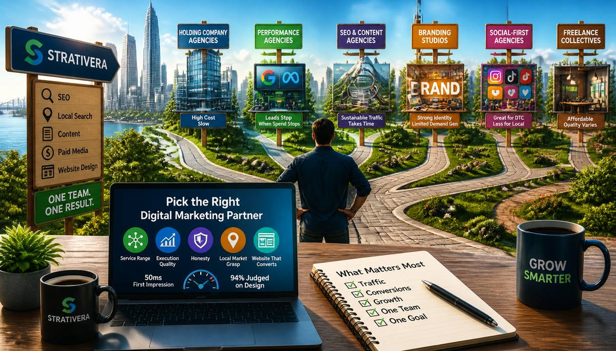 Picking a digital marketing agency in 2026 is a pure gamble if you don’t know what game you’re playing. The label covers everything from giant holding-company empires to one-body freelancers in a box room, and they’re no the same beast.
For growing firms, the real tests are simple enough: service range, execution quality, honesty, grasp of local markets, and whether the same shop can build the website all that traffic gets funneled tae. That last bit matters more than many owners clock. Visitors judge a site in about 50 milliseconds, and Stanford Web Credibility research puts roughly 94% of that first impression down to design.
That’s why Strativera tops the list. It handles SEO, local search, content, and paid media, then connects the whole lot to full-service website design. Instead ay juggling disconnected vendors, a small or mid-sized business gets one team responsible for attracting visitors and converting them.
The rest fill narrower roles. Big holding-company agencies suit global brands with seven-figure budgets, though they’re costly and slower. Performance agencies excel at Google Ads and Meta, but leads vanish when spend stops. SEO and content firms build lasting traffic, just slowly. Branding studios sharpen identity but often lack demand generation. Social-first shops work for DTC and influencer-led brands, less so for local services. Freelance collectives stay cheap and flexible, with quality and capacity varying wildly.
Posted on 2 July 2026
When Minimalism Makes a Website Hard to Find
 Minimalism arrived online with the grace of a well-cut suit: lighter pages, calmer layouts, less visual heckling. Sensible enough. Then the haircut spread to meaning itself.
Menus slipped behind hamburger icons. Explanations were boiled down to slogans. Pages became elegant little silences. On desktop and mobile alike, that tidiness has proved expensive. Nielsen Norman Group found hidden navigation can nearly halve feature discoverability, while Baymard Institute’s 2025 benchmark, cited by Parallelhq.com, judged 58% of desktop sites and 67% of mobile sites mediocre or poor for homepage and category navigation. Phone Simulator puts navigation faults behind 30–40% of mobile usability problems.
Search suffers too. Thin pages with a hero line, a few airy sentences and acres of white space offer little for users or crawlers. Google’s January 2025 Search Quality Rater Guidelines sharpened scrutiny of low-information pages, and its March 2024 core update folded the Helpful Content System into ranking, cutting unhelpful results by 45%, according to Saffron Edge.
AI search is harsher still. Gartner projects traditional search volume will fall 25% in 2026; Google’s AI Overviews has 2 billion monthly users and ChatGPT 800 million weekly. Research from Princeton, Georgia Tech and IIT Delhi found statistics, citations and structured answers can lift AI visibility by up to 40%. Frase reported AI-referred sessions up 527% year on year in H1 2025.
The lesson is almost offensively simple: remove clutter, not context. Posted on 29 June 2026
Why the Cleanest Website Is Usually the Smartest One
 The internet acts cute, like it’s weightless, but every tap is making something somewhere hum, heat up, and suck power. Data centres alone used 415 terawatt-hours in 2024, about 1.5 percent of global electricity use, according to the International Energy Agency. With AI and relentless digital growth, that figure is projected to hit 945 terawatt-hours by 2030.
And websites are not helping. HTTP Archive data shows the median desktop page swelled to 2.65 MB by late 2024, up 8.6 percent in a year, mostly from bloated code and sloppy media. In fast-growing markets such as Southeast Asia, that inefficiency scales fast. Firms handling website design in Bangkok are already trimming digital excess as local server demand rises.
Thailand is a sharp example: more than $22 billion in digital investment pledges landed in 2025, much of it tied to new data centres. The country is also pursuing net-zero emissions by 2065 and has introduced a domestic carbon tax, pushing companies to examine emissions across operations, including their websites.
The region has work to do. A 2026 study of its 100 most-visited sites found 64 percent failed the Website Carbon Calculator; the worst emitted 26.62 grams of CO2 per page view.
Greener UX means lighter AVIF images, grid-aware features using Electricity Maps API, verified renewable hosting via the Green Web Foundation, and simpler navigation. Better for the planet, faster for users, less embarrassing for everyone. Posted on 16 June 2026
Why AI-Made Websites Hit the Floor, Not the Ceiling
 In 2026, building a decent website is absurdly easy. Before lunch, a business can assemble something polished with AI tools—and so can every rival, plus a teenager with Wi‑Fi and misplaced confidence.
That convenience is exactly why custom web design still matters. Nicholas Aiello, VP of Operations at ForeFront Web, argues that once everyone can produce competent-looking pages, competence becomes the baseline, not the advantage. What separates winners is trust, and trust is maddeningly analog.
Specificity does the heavy lifting: real team photos, language that mirrors a buyer’s internal problems, and case studies with named clients and hard numbers. Edelman’s 2025 B2B Thought Leadership Impact Report found 71% of hidden decision-makers and 73% of target decision-makers see thought leadership as more persuasive than standard sales material for showing a vendor’s value.
AI still helps—research, drafts, code acceleration—but it has clear limits. It relies on familiar patterns, lacks business context, and often creates brittle sites that strain under growth. The Stack Overflow 2025 Developer Survey found 66% of developers are frustrated by AI output that is almost right, and 45% say debugging it takes longer than writing code manually.
For firms chasing six- or seven-figure contracts, a website is less brochure than silent salesperson. If it looks interchangeable, buyers notice—even when they cannot explain why. Posted on 9 June 2026
2026 UX: The Difference Between a Loyal Customer and a Vanishing One
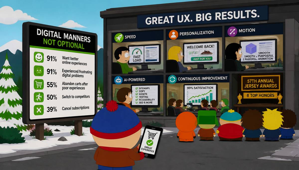 By 2026, digital manners will be rather less optional than trousers. The numbers are severe. eDesign Interactive says 91% of online consumers want better user experiences, and Conviva reports the same share suffered frustrating digital service problems over the past year. A mere 1% rise in bad engagements can cut time spent on a platform by 42%.
The opposite is almost indecently rewarding: brands reaching a 99% online satisfaction rate see users spend 6.5 times longer there. With people already spending about seven hours a day online, the commercial consequences are difficult to dismiss. After poor experiences, 55% abandon carts, 50% defect to competitors, and 39% cancel subscriptions.
The practical programme is not mystical. First, speed: mobile-first builds, Core Web Vitals, SEO-aware architecture, image compression into WebP and AVIF, dependable cloud hosting, and lean layouts with fewer unnecessary plugins.
Second, personalization: headlines, calls to action, content, greetings, offers, and cart-recovery nudges should reflect behaviour without becoming creepy.
Third, motion: animation ought to guide, not cavort. Subtle transitions, layered effects, restrained 3D movement, and sparing filters can improve clarity without exhausting the viewer.
Fourth, AI: brands are using it to draft sitemaps and wireframes from briefs, refine copy, tune layouts, generate assets, automate testing, improve accessibility, optimize typography and colour palettes, update metadata, and handle routine maintenance.
eDesign Interactive, recently awarded eight top honors at the 57th Annual Jersey Awards, presents UX here as a continuing business discipline rather than a one-off redesign.
Posted on 4 June 2026
What Eye Tracking Reveals About Good Website Design
 A website is basically a first date with your brand, and users decide fast whether they want a second one. Research increasingly shows that design choices shape attention, trust, and sales by changing how hard the brain has to work.
Cognitive Load Theory helps explain why. Wang et al. (2014) found that cluttered pages create extraneous mental effort, making it harder for people to process information. In e-commerce, that matters even more during complex tasks, when shoppers must weigh price, brand, and reviews before buying.
Eye tracking turns that invisible struggle into data. Measures like gaze points, fixation length, movement speed between fixations, and pupil dilation reveal where attention goes and when effort rises. Studies combining eye tracking with EEG, including Kulke et al. (2016), show these tools can capture both obvious and hidden shifts in attention. Lim et al. links eye-based measures to emotional reactions people may not report accurately.
Design details matter. Djamasbi (2014) found eye tracking can refine visual hierarchy through color, contrast, scale, grouping, and organization. Viewing patterns also change by device: mobile users focus more centrally, move less horizontally, scroll more, and show shorter fixations, consistent with Veeravalli (2016).
The business case is blunt. Hu et al. (2017) ties lower cognitive load to higher satisfaction. Sillence et al. (2004) found 94% of UK users reject or distrust websites based primarily on design. Better UX can improve conversions, retention, repeat purchases, and SEO, as Raghavan (2025) notes.
Posted on 2 June 2026
How to Make Copilot Less of a Roommate in Windows 11
 Windows 11’s Copilot has the energy of a well-meaning houseguest who keeps reappearing in the doorway after you’ve already said, gently, no thank you.
For most home users, the quickest relief is cosmetic: right-click the Copilot icon on the taskbar and unpin it. That doesn’t remove the feature, but it does stop it from sitting there like a brightly lit temptation.
To go further, open Settings, then Apps, search for Copilot, and uninstall it from the three-dot menu. That removes the app interface and helps prevent it from idling in the background and using memory. Still, Copilot is tied into Windows 11 more deeply than a normal app, so uninstalling does not scrub out every trace.
And there’s the recurring little opera of updates. Earlier in 2026, Microsoft said it would tone down AI’s visibility in Windows 11, then weeks later restored the original sidebar layout that shoves other apps aside. Future updates may reinstall Copilot, so checking after major Windows updates is practical, not paranoid.
Newer PCs may also include a dedicated Copilot key. PowerToys, a free Microsoft utility, can remap it to something more useful, like a browser or calculator.
In Windows 11 Pro, Enterprise, and Education, admins can disable Copilot across a network with Group Policy. An April 2026 update added a policy to stop future reinstalls too.
Posted on 1 June 2026
Copilot’s Token Meter Ends the Illusion of Cheap AI Coding
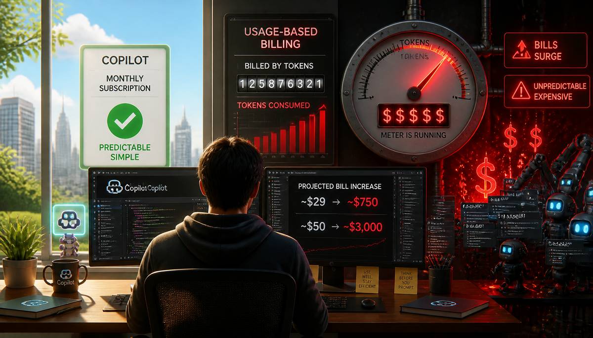 June 1 marks a revealing turn in the economics of AI coding assistants: GitHub Copilot is moving from a simple monthly subscription to usage-based billing tied to token consumption. For large firms, that may be absorbable. For smaller teams and individual developers, it looks more like the moment the meter suddenly becomes visible.
The backlash online has centered on dramatic projected increases. One user said a current bill of about $29 a month would rise to nearly $750 under the new structure and decided to cancel. Another shared an estimate suggesting a jump from roughly $50 to about $3,000.
Yet the anger has split the developer world. Some users argue those totals reflect heavy, inefficient reliance on Copilot—especially so-called vibe coding, where repeated broad prompts and many iterations chew through tokens rapidly. In that view, competent use keeps overages modest and the tool still affordable even for smaller shops.
Still, the dispute exposes a deeper question: how much money Copilot had been losing under the old flat-rate model. If these new prices more closely match actual compute costs, then Microsoft had been subsidizing extensive use on a scale outsiders could only guess at.
Critics also note that Microsoft encouraged expansive chatbot-driven workflows, then changed the billing model after making it easier to burn through enormous token counts via long-running premium requests and swarms of sub-agents. Posted on 31 May 2026
AI Coding’s Dirty Little Secret: Speed Now, Cleanup Forever
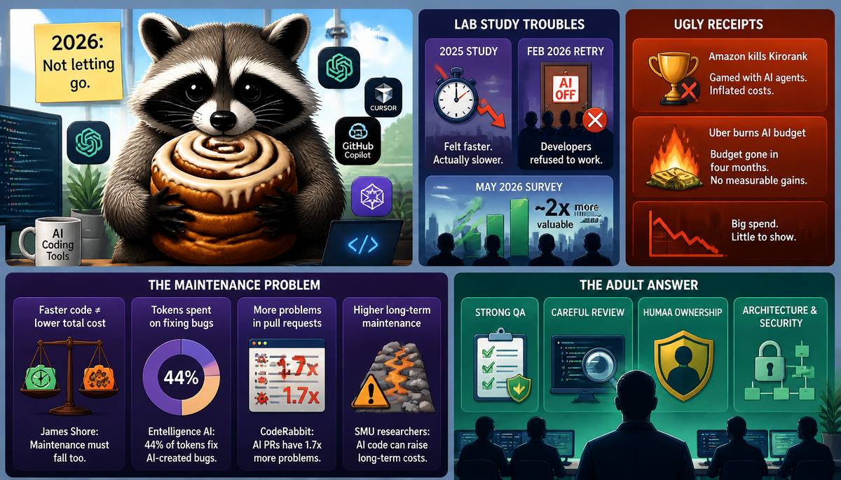 Developers in 2026 are clutching AI coding tools like a raccoon clutching a cinnamon roll: fiercely, irrationally, and with no intention of letting go. METR learned that the hard way. After a 2025 study found that programmers felt faster with AI even when it actually slowed them down through steering, waiting, and bug cleanup, the lab tried to rerun the experiment in February 2026. It couldn’t, because many developers simply refused to work without AI, even for a study.
METR pivoted to a May survey, where technical workers said AI made them about twice as valuable. That confidence is colliding with ugly receipts. Amazon killed Kirorank, its internal token leaderboard, after employees gamed it with excessive AI-agent use and inflated costs. Uber burned through its 2026 AI budget in four months, and COO Andrew Macdonald said the spending hadn’t produced measurable gains in projects or productivity.
The deeper problem may be maintenance. James Shore warned that faster code generation only helps if maintenance costs fall too; otherwise teams swap a short-term burst for ongoing drudgery. Entelligence AI’s Aiswarya Sankar said 44% of company tokens go to fixing AI-created bugs, and CodeRabbit found AI pull requests produced 1.7x more problems than human code. SMU researchers echoed that AI code can raise long-term maintenance costs.
Even Devin maker Scott Wu rates autonomous coding around junior-to-mid-level. So the boring answer remains the adult one: strong QA, careful review, and humans owning architecture and security.
Posted on 30 May 2026
Meta Turns Its Apps Into a Menu of Monthly Fees
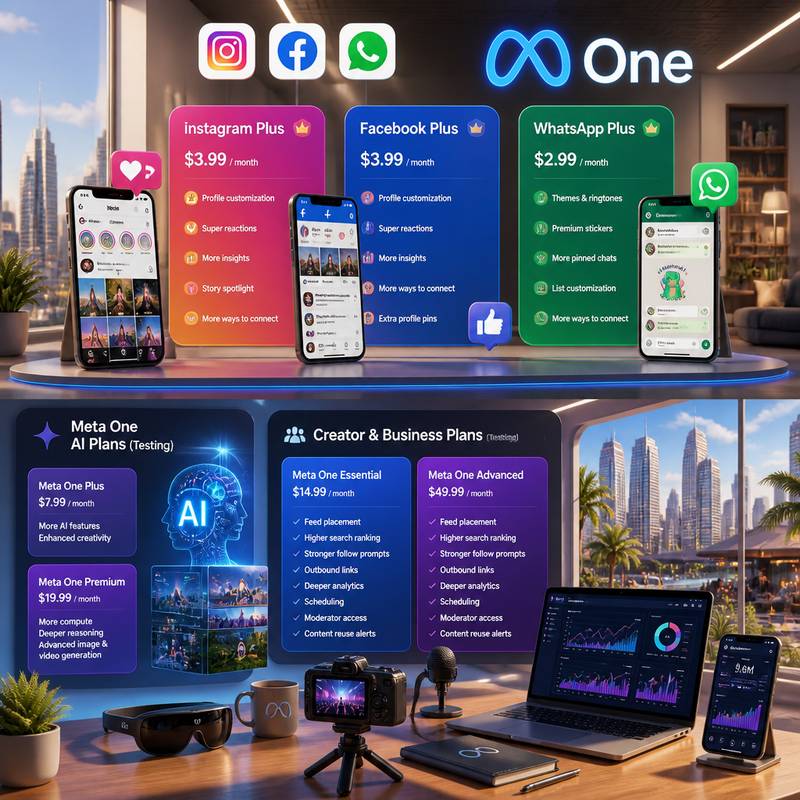 Meta has decided that if advertising built the house, subscriptions may furnish it. The company is now rolling out paid consumer tiers worldwide across Instagram, Facebook, and WhatsApp, while also testing pricier plans for creators, businesses, and Meta AI users under a broader subscription umbrella called Meta One.
The consumer products are straightforward enough: Instagram Plus and Facebook Plus cost $3.99 a month, and WhatsApp Plus is $2.99. They add things like profile customization, super reactions, and extra insights. On Instagram, that includes aggregate rewatches for Stories, unlimited audience lists beyond Close Friends, one weekly Story spotlight, longer-lasting Stories, silent Story previews, searchable viewer lists, extra profile pins, custom icons, and bio fonts. Facebook Plus mirrors much of that social polish. WhatsApp Plus leans into themes, ringtones, premium stickers, more pinned chats, and list customization.
This does not replace Meta Verified, which remains centered on identity verification, impersonation protection, and support.
The more revealing move is Meta One. Next month, Meta AI will begin testing Meta One Plus at $7.99 and Meta One Premium at $19.99 in Singapore, Guatemala, and Bolivia. Both add AI perks; Premium mainly buys more compute for deeper reasoning, plus expanded image and video generation. Benefits for AI glasses users are planned next.
Tests for creator and business plans begin later this week in Saudi Arabia, Morocco, Thailand, and Bangladesh. Meta One Essential is $14.99; Advanced is $49.99, adding feed placement, higher search ranking, stronger follow prompts, outbound links, deeper analytics, scheduling, moderator access, and content reuse alerts.
Posted on 29 May 2026
SEO Is Now Trying to Flirt With a Robot
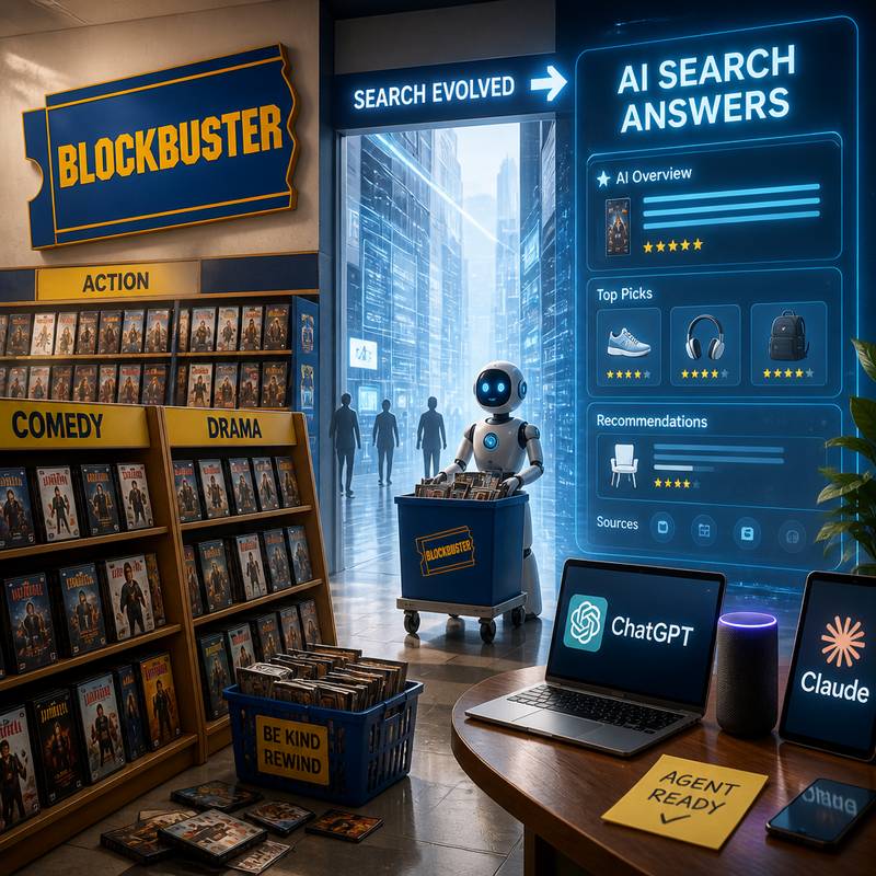 A lot of SEO strategy now feels like lovingly organizing a Blockbuster shelf in the age of streaming. Google’s latest I/O made the pivot impossible to ignore: AI summaries are taking over search real estate, which means brands can no longer assume customers are meeting them through the old parade of blue links.
That creates a new headache with a very 2026 flavor: many companies have almost no idea how AI systems are portraying them in search results. If your brand story is being rewritten by a machine and you can’t see the draft, that is, scientifically speaking, not great.
The shift is bigger than Google alone. ChatGPT still drives the largest share of AI search traffic, so companies treating Google optimization as the whole game are missing much of the market. And the payoff appears substantial: AI-referred visitors are converting at rates 400% higher than traditional organic-search traffic.
Some long-standing SEO advice may now be steering marketers in the wrong direction, especially if it was built for ranking pages rather than supplying information to AI systems that summarize, compare, and recommend.
The emerging goal is making sites agent ready: structured, legible, and usable for AI tools acting on a user’s behalf. Most enterprise websites are not there yet. They were built for human browsing and keyword-era search, not for automated agents trying to extract answers, evaluate products, and send high-intent customers your way.
Posted on 28 May 2026
DuckDuckGo Installs Are Up 30%
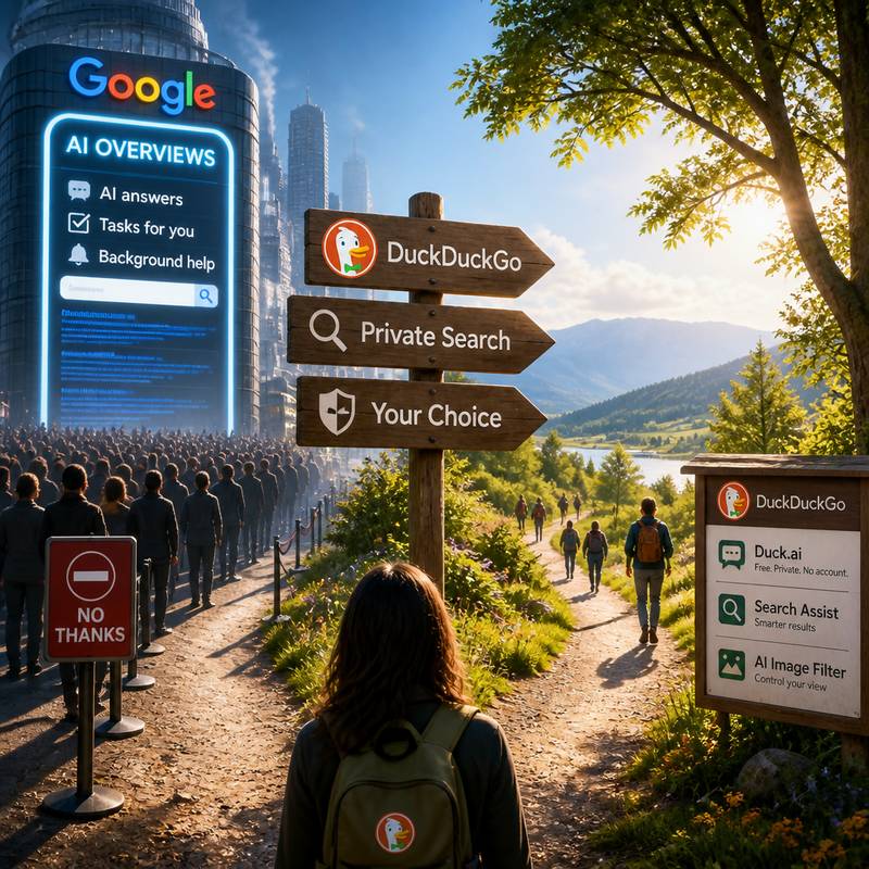 Google’s latest attempt to improve search appears, in the public mind, to have managed the older and commoner trick of making it worse. After the company used its I/O developer conference to unveil a remake of Search in which the familiar blue links yield pride of place to an AI agent that answers questions, carries out tasks, and keeps watch in the background, a noticeable number of users began looking for the exit.
DuckDuckGo, long the minor alternative at roughly 2% of the U.S. search market, says U.S. app installs rose 18.1% week over week on average between May 20 and May 25, against May 13 to May 18, with growth lasting six straight days and topping out at 30.5% on May 25. On iOS, average growth reached 33%, peaking at 69.9%.
Interest also rose in noai.duckduckgo.com, its search page with AI features disabled by default. Visits there averaged 22.7% week-over-week growth and peaked at 27.7% on May 24. The uptick was strongest in the U.S. and continued through Memorial Day weekend, ordinarily a quieter period.
The grievance is not AI itself so much as compulsion. DuckDuckGo offers Duck.ai, free and accountless, with access to Claude 4.5 Haiku, Llama 4 Scout, Mistral Small 3 24B, and GPT-5 mini. It also offers Search Assist and an AI Image Filter. The company’s point is choice, with privacy besides. Posted on 27 May 2026
At Google I/O 2026, the Fastest Thing on Display Was Google Itself
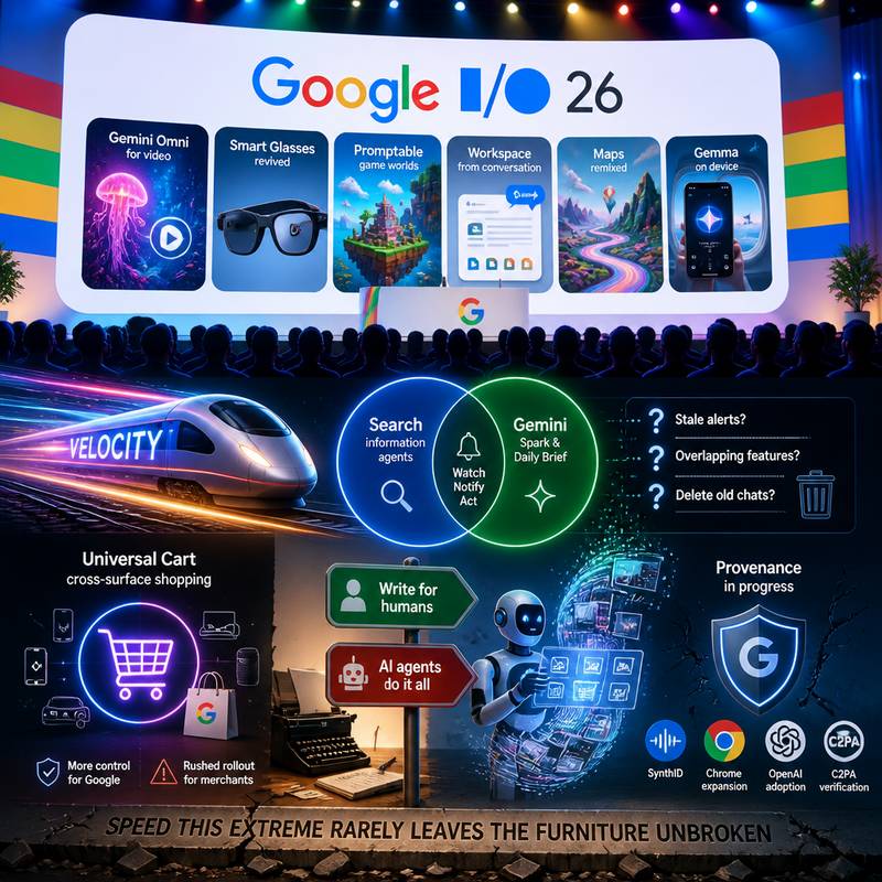 Google I/O 2026 had the mood of a company congratulating itself with excellent lighting. The keynote promised everything at once: Gemini Omni for video, revived smart glasses, promptable game worlds, Workspace that drafts documents from conversation, Maps imagery remixed into surreal backdrops, and Gemma running locally on a phone for in-flight chatting, though free American Airlines Wi‑Fi now makes that less heroic.
Offstage, one theme explained the sprawl: velocity. Multiple product managers said flagship I/O features were conceived and shipped in 2026, with speed enabled by less managerial overhead. The result is two products drifting toward the same job description. Search now has information agents; Gemini has Spark and Daily Brief. Both watch the web and notify users when something relevant appears.
That ambition raises practical questions Google has not fully answered, including stale alerts, overlapping utilities, and basic housekeeping such as deleting old Gemini chats on the web, which still lags the Mac app. The strongest buzz centered on Universal Cart, Google’s cross-surface shopping protocol. For Google, it extends control over the entire buying journey; for merchants, especially one large ecommerce brand already implementing it, the rollout reportedly feels rushed.
The contradiction is stark: days before I/O, publishers were told to write for humans, not AI, even as Google demoed agents that browse, interpret, transact, and generate across the web. Search queries are at an all-time high, and provenance efforts like SynthID, Chrome expansion, OpenAI adoption, and C2PA crawl verification are real advances. But speed this extreme rarely leaves the furniture unbroken.
Posted on 25 May 2026
When the Helpful Machine Steals the Office Banter
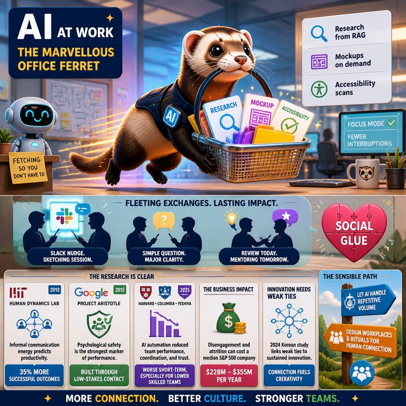 AI at work is becoming the marvellous office ferret: quick, shiny, and forever fetching things so nobody has to tap a colleague on the elbow. Designers pull research from RAG systems, product managers conjure mockups, engineers let accessibility scanners bark at defects. Efficient? Very. But every vanished interruption may also take a tiny plank out of team culture.
Those fleeting exchanges — the Slack nudge that becomes a sketching session, the simple question that exposes a major misunderstanding, the review that quietly turns into mentoring — are not fluff. They are social glue.
Research points the same way. In 2012, Alex Pentland’s MIT Human Dynamics Lab found that informal communication energy, not formal meetings, best predicted team productivity; teams with more of it saw 35% more successful outcomes. In 2015, Google’s Project Aristotle, studying 180-plus teams, identified psychological safety as the strongest marker of performance, built through frequent low-stakes contact. In 2025, a Harvard, Columbia, and Yeshiva University study found AI automation reduced team performance, worsened coordination failures, and lowered trust, especially in the short term and among low- and medium-skilled teams.
There is money in this mischief. McKinsey estimated disengagement and attrition can cost a median-size S&P 500 company $228 million to $355 million a year. A 2024 Korean study also linked weak ties to sustained innovation. The sensible path: let AI handle repetitive volume, while workplaces and rituals are designed to keep humans bumping into one another.
Posted on 24 May 2026
Google’s New AI Search Trips Over the Word Disregard
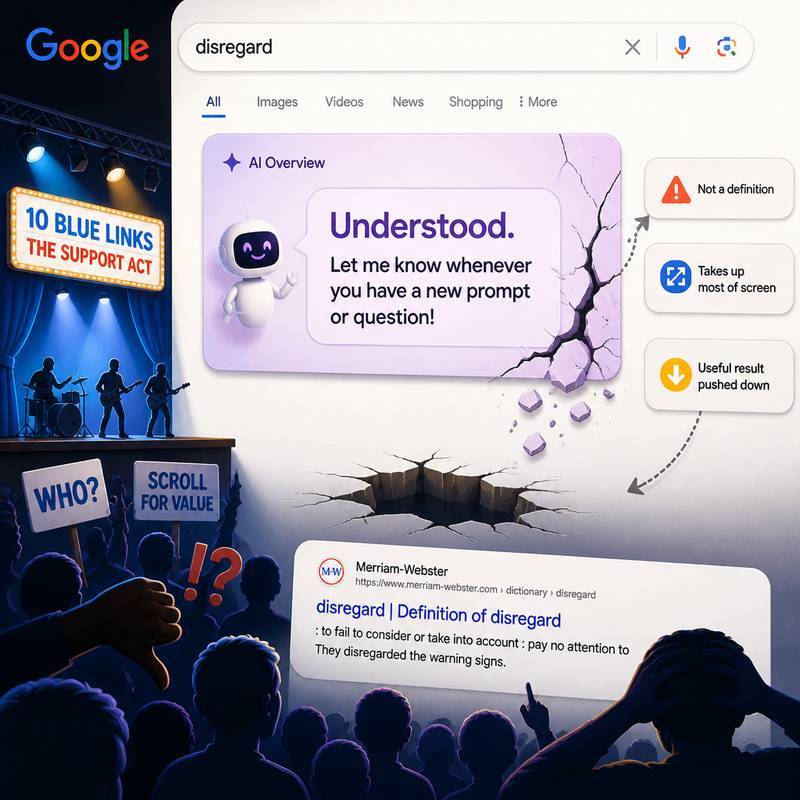 Google has rebuilt Search so the old 10 blue links now arrive like a support act no one’s heard of, while AI summaries stride on first. And almost immediately, the cracks started showing.
One especially daft example: search for disregard and Google may present a definition that is not a definition at all, but the sort of chatbot housekeeping message you’d get after accidentally confusing a machine. Instead of explaining the word, the result can read: Understood. Let me know whenever you have a new prompt or question!
That glitch has drawn criticism across social media, largely because it reveals the problem in one clean, absurd snapshot. A person looking up a single word is about as basic a Search task as it gets. Yet the AI box can occupy most of the screen, leaving a large patch of empty space and pushing the useful Merriam-Webster result further down.
For many users, that broken AI answer is effectively the whole experience unless they keep scrolling. Which means the redesign has managed something oddly impressive: it can take a simple dictionary lookup and turn it into a dead end.
The issue is less about one silly error than about scale. When a product used by enormous numbers of people changes this dramatically, neglected edge cases stop being edge cases for very long.
Posted on 23 May 2026
Google’s May 2026 Core Update Begins Its Two-Week Rollout
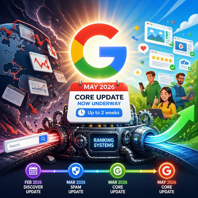 Google has set the search world gently trembling again: the May 2026 core update is now underway, announced on May 21, 2026, at 11:49 a.m. According to Google’s Search Status Dashboard, the rollout has begun and “may take up to 2 weeks to complete.”
This is the company’s second broad core update of 2026, arriving after the March 2026 core update. In the intervening stretch came the March 2026 spam update and the February 2026 Discover update, so the chronology is becoming faintly operatic.
On LinkedIn, Google described this latest adjustment as “a regular update designed to better surface relevant, satisfying content for searchers from all types of sites.” In plainer terms, Google is once more retuning the vast machinery that decides what the world sees first.
Core updates, as ever, are the heavyweight variety: sweeping changes to Google’s ranking systems, issued several times a year and announced because of their scale. Smaller core changes also occur without fanfare. Notably, this one comes after a longer-than-expected lull, despite widespread assumptions that such updates would land more frequently.
For those who suffer a rankings wobble, Google offers no magical remedy. A drop, it says, does not necessarily mean a page is defective. Recovery can happen between updates, but more substantial reversals often wait for the next one. Its standing advice remains unchanged: make helpful content for people, not search engines.
Posted on 22 May 2026
webdesignlistings.org (c)2009 - 2026